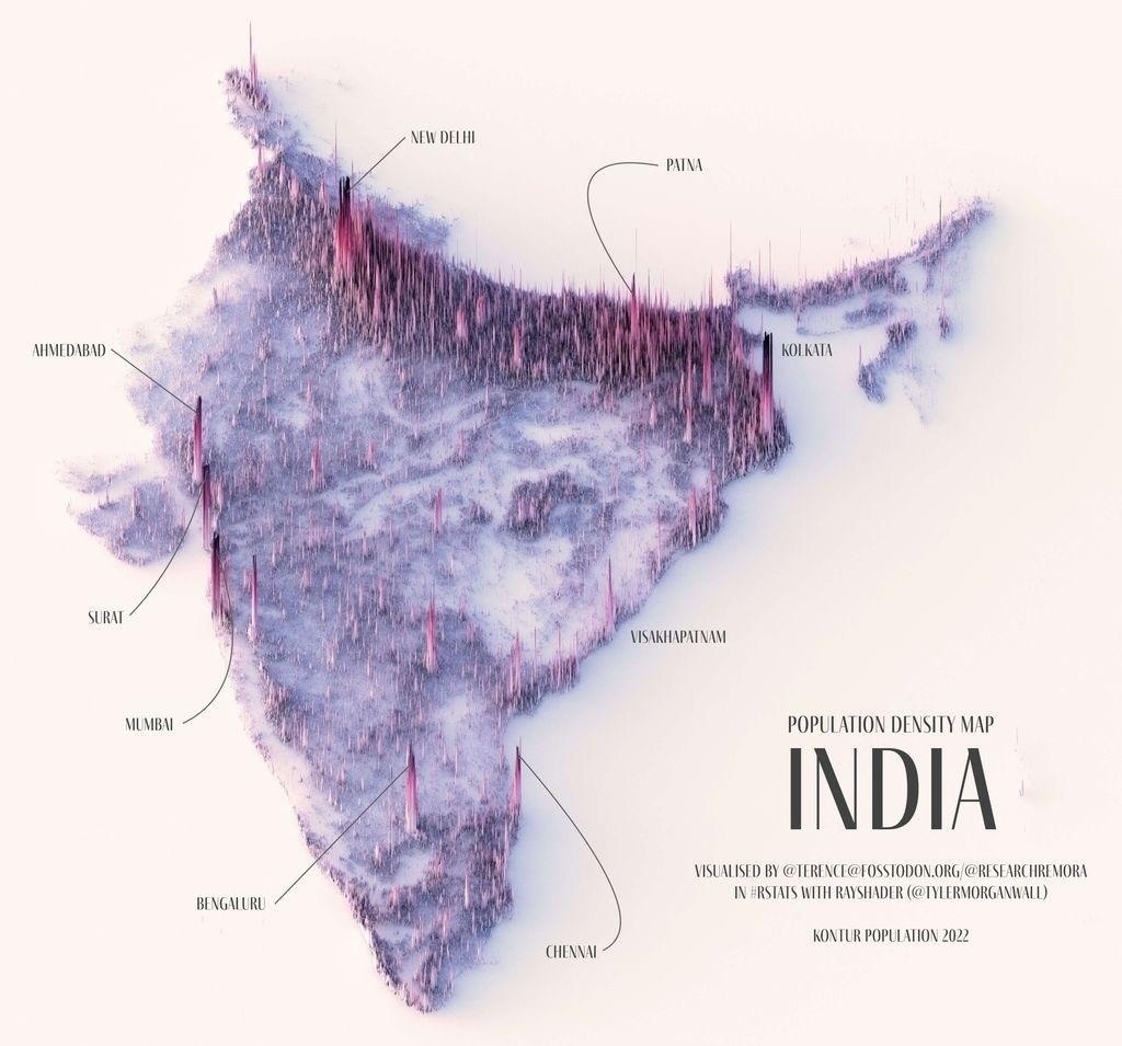
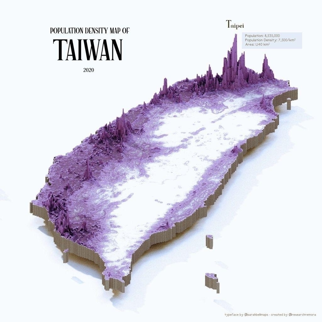
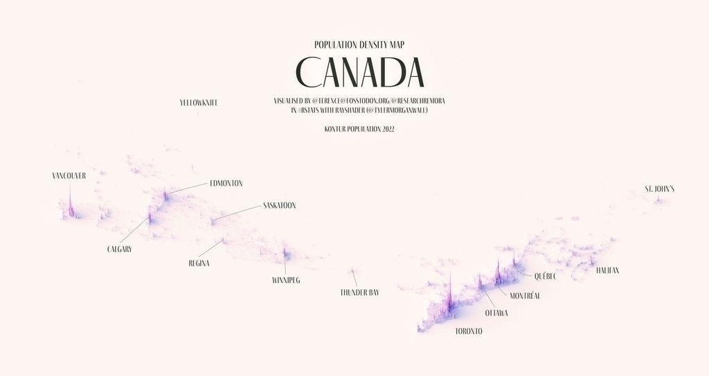
Population density spike maps by www.instagram.com/researchr…

(via @infobeautiful@vis.social)

A population density map of India visualized in a 3D style. The map uses pink and purple spikes to represent population density, with higher spikes indicating denser populations. Major cities labeled include New Delhi, Mumbai, Bengaluru, Chennai, Ahmedabad, Surat, Visakhapatnam, Kolkata, and Patna. The map features stylistic shading and a soft color palette. It includes credit to the creators and sources used for visualization.A 3D population density map of Taiwan from 2020 is displayed. The map features a topographic representation with varying heights in shades of purple, indicating population density. Taller regions such as Taipei show higher density. The text indicates Taipei's population is 8,355,000 with a density of 7,500 people per square kilometer, and an area of 1,140 square kilometers.A population density map of Canada from 2022. The map features a white background with purple shading indicating areas of higher population density. Key cities, including Vancouver, Calgary, Edmonton, Saskatoon, Regina, Winnipeg, Thunder Bay, Toronto, Ottawa, Montreal, Quebec, Halifax, St. John's, and Yellowknife, are labeled. The map is titled "Population Density Map Canada" and credits Terran@cotoid.org for visualization and Bjørn Sandvik for inspiration.

*****
Written on